Why use Grid.Systema.tically?
Why use a grid system?
Using a grid system allows you to rapidly develop web layouts within the browser. Meaning you can focus more on your design work and less on your CSS code.
Why Grid.Systema.tically?
-
Lightweight
Grid.Systema.tically is designed to be incredibly lightweight, consisting of a small CSS file (the less columns you specify, the smaller the file size is).
-
Simple
With only columns and margins to worry about, it is incredibly easy to understand and get started using Grid.Systema.tically to layout your web pages
-
Print Based
Grid.Systema.tically's design is based on that of the grids you would normally use in InDesign. Making the transition from print to screen design easier.
How to use Grid.Systema.tically
There are three elements within a HTML page using Grid.Systema.tically, all of which are defined by using the 'class' attribute.
class="grid container"
This is the container for the grid system. By default it is aligned to the left. All grid elements must be within this, however there is nothing to stop you from using more than one of these grid containers in your page.
class="grid col_x margin_yz"
This is the class attribute for each individual element within the grid system. There are three variables you will need to specify:
x | The number of columns the grid element spans. |
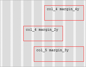
y | The number of columns to the left of the element to be white space (essentially how many columns the left margin of the item should span). This value can be from 0 to (the number of columns in the system − 1). (see fig.1) |
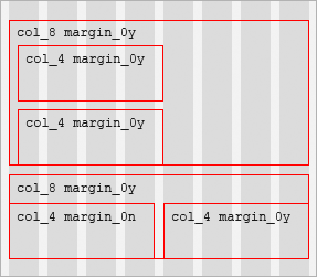
z | Either y or n (for yes or no, respectively). Should the margin include the gutter gap to the far left of the margin? You can use this to handle elements sitting on the left of a parent element to avoid double margins. (see fig.2) |
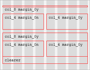
class="clearer"
This element acts as a clearing element. Because all content elements are floated, it is necessary to include this to make sure parent elements expand to fit their child elements vertically. (see fig.3)